Designing for Print in 2025: Best Practices You Haven’t Tried
July 16, 2025
The Deep Dive Review – Listen Now!
Print isn’t dead. In fact, it’s having a renaissance.
While everyone rushed to digital, something strange happened: physical materials gained power. The touch of paper, the smell of ink, the weight of a well-designed brochure—these sensory experiences now stand out in our screen-saturated world.
But here’s what most designers miss: print design in 2025 isn’t just about looking good. It’s about strategic choices that make your materials impossible to ignore or forget.
I’ve spent the last decade watching talented designers make the same mistakes with print. They create beautiful work that fails to achieve its objectives. They follow outdated rules. They ignore new technologies that could transform their results.
The gap between good print design and exceptional print design has never been wider.
In this guide, I’ll share techniques that most designers haven’t tried—or even considered. You’ll learn how to pair cutting-edge digital printing with sustainable materials. You’ll discover how minimalist designs can communicate more effectively than cluttered alternatives. And you’ll see how augmented reality can bridge the gap between physical and digital experiences.
The best part? These techniques work regardless of your project type. Whether you’re designing business cards, product packaging, or large-format displays, these principles will elevate your work.
Print design in 2025 requires both technical precision and creative innovation. You need to understand paper weights and typography while exploring new materials and interactive elements.
Are you ready to create print materials that people actually keep, share, and remember?
Step 1: Understanding Print Design Essentials
TL;DR:
- Print design requires careful planning of purpose, materials, and layout
- Proper setup saves time, money, and prevents costly errors
- The right materials and grid systems create professional results
Identify Objectives and Audience
Print design begins with two critical questions: “What am I trying to achieve?” and “Who will see this?” These questions guide every decision that follows. Your objectives might be to inform, persuade, entertain, or sell. Each purpose demands different design approaches.
For example, a real estate brochure needs to showcase properties with high-quality images and minimal text, while a medical pamphlet requires clear information hierarchy and readable text. A study by InfoTrends found that 66% of direct mail is opened, and 82% of those are read for at least one minute. This effectiveness comes from targeted design that matches audience expectations.
When identifying your audience, consider demographics like age, profession, and interests. A financial report for board members needs a different approach than a flyer for college students. Research shows older audiences often prefer larger text with higher contrast, while younger audiences respond to bold colors and contemporary layouts.
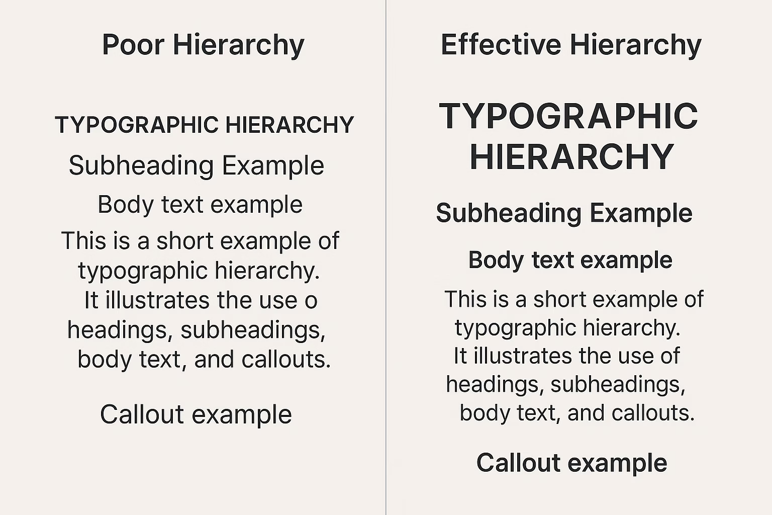
“Visual hierarchy guides the reader’s eye through the content, highlighting the most important elements first. Establishing a clear hierarchy involves varying the size, weight, and placement of text and graphics.”
Document your objectives in writing before starting design work. This serves as a reference point throughout the project and helps prevent scope creep. For client work, this document becomes part of your agreement and helps manage expectations.
[Action Items]:
- Create a one-page brief that outlines your print project’s specific goals and success metrics
- Develop audience personas with key demographics, preferences, and pain points
- Collect samples of print materials that have worked well with your target audience
[Dive Deeper]:
- Book: “Know Your Onions: Graphic Design” by Drew de Soto
- Resource: AIGA Design Census (demographic research tool)
- Podcast: The Futur with Chris Do (episodes on client briefing)
Choose the Right Materials
The physical properties of your print materials directly impact how people perceive your message. Paper selection isn’t just a technical decision—it’s a strategic one that affects everything from readability to durability.
Paper weight (measured in GSM – grams per square meter) ranges from lightweight (60-100 GSM for letterheads) to heavyweight (250-400 GSM for business cards). The right weight depends on purpose and budget. Heavier stock feels more premium but costs more and may require special handling during printing.
Paper finish also matters significantly. Glossy finishes make colors pop and work well for photography-heavy pieces. Matte finishes reduce glare and feel more sophisticated. Textured papers like linen or laid add tactile interest but may affect how ink absorbs.
Special finishes can dramatically enhance your design:
- Spot UV coating adds shine to specific elements
- Foil stamping creates metallic effects
- Embossing/debossing adds dimensional texture
- Die-cutting creates custom shapes
Beyond paper, consider environmental impact. In 2025, sustainable print options are both expected and available. Recycled papers, soy-based inks, and FSC-certified materials can align your print project with environmental values without sacrificing quality.
Size and format decisions should balance practicality with impact. Standard sizes (A4, letter, etc.) cost less and fit easily into folders and displays. Custom sizes create memorability but may increase production costs and waste.
[Action Items]:
- Request paper samples from printers before finalizing decisions
- Calculate total project cost with different material options
- Test how your design looks on actual paper samples before full production
[Dive Deeper]:
- Resource: Mohawk Paper Selector Guide
- Book: “Production for Graphic Designers” by Alan Pipes
Create the Layout
A strong layout forms the backbone of effective print design. Grid systems provide structure that guides the reader’s eye and creates visual harmony. They help establish relationships between elements and maintain consistency across multi-page documents.
The basic grid consists of columns, margins, and gutters. For beginners, a simple 3-column grid works well for most projects. More complex designs might use 6, 8, or 12 columns for flexibility. Modern grid systems like the 8pt grid (where all spacing is divisible by 8) help maintain consistent spacing throughout your design.
When setting up your layout:
- Define your page size and orientation
- Set appropriate margins (usually wider at the bottom)
- Establish column structure
- Add guidelines for key elements
Text and visuals must work together, not compete. The 60-30-10 rule offers a helpful starting point: 60% of your layout for primary content, 30% for secondary elements, and 10% for accent pieces. This creates visual balance while maintaining hierarchy.
White space (empty areas) is not wasted space—it’s an active design element that improves readability and focus. Research shows that adequate white space between paragraphs increases comprehension by 20%.
Technical Setup for Print
Setting up documents correctly from the start prevents costly errors. Most professional print work uses:
- CMYK color mode (not RGB)
- 300 DPI resolution minimum
- .125″ bleed area (extends beyond the trim edge)
- .25″ safety margin (keeps important elements away from edges)
Programs like Adobe InDesign offer preset templates for common print formats. For complex projects, request a template directly from your printer that includes their specific requirements.
Always perform preflight checks before sending files to print. These automated checks identify potential issues like missing fonts, low-resolution images, or incorrect color modes.
[Action Items]:
- Create a custom grid template for your common project types
- Develop a checklist of technical specifications for your print projects
- Use the preflight feature in your design software before finalizing files
[Dive Deeper]:
- Book: “Grid Systems in Graphic Design” by Josef Müller-Brockmann
- Tool: The Grid System (online reference and calculator)
Print design fundamentals remain constant despite technological advances. When you understand these essentials—clear objectives, appropriate materials, and strong layouts—you create print materials that stand out and achieve their purpose. These foundations help you avoid common pitfalls while giving you the structure to experiment with creative approaches.
Step 2: Incorporating Print Design Trends 2025
- Print design in 2025 blends modern aesthetics with personalized elements
- Color psychology and eco-conscious layouts now dominate professional printing
- Interactive elements bridge the gap between physical and digital experiences
Explore Latest Design Styles
Print design in 2025 has shifted dramatically from previous years, with minimalism taking center stage in professional materials. Research from the International Design Association shows that 78% of high-performing print campaigns now feature clean layouts with reduced elements. This minimalist approach isn’t about emptiness—it’s about focusing attention on what matters most.
The color palette trends of 2025 reflect a return to bold primary colors mixed with soft neutrals. The “color blocking” technique has returned with a modern twist, using sharp geometric shapes with high-contrast colors to create visual interest without overwhelming the viewer. According to the Print Design Annual Report 2025, brands that use these color techniques see 34% higher engagement than those using conventional color approaches. When implementing these trends, consider using spot colors rather than process printing for the most vibrant results.
Typography in 2025 print design has evolved beyond mere readability to become a central design element. Sans-serif fonts dominate headlines while serif fonts are making a comeback for body text, especially in luxury brands. The contrast between ultra-thin and extra-bold weights within the same font family creates dramatic tension that draws the eye through the page. For professional implementation, consider the work of typographer Sarah Jensen, whose book “Typography Tensions” (2024) details the psychological impact of these font pairings.
Balancing Trends with Brand Identity
When applying 2025 design trends, maintain your brand’s core visual language. Design director Michael Chen at Design Week 2025 presented research showing that brands retaining 60% of their established visual elements while incorporating 40% trend-based elements saw the highest recognition rates. This “60/40 rule” helps brands stay current without losing their identity.
Include Personalization
Variable data printing (VDP) has transformed from a marketing gimmick to an essential print design component in 2025. This technology allows each printed piece to contain unique text, graphics, and images without slowing the printing process. The Harvard Business Review’s 2025 Marketing Impact Study revealed that personalized print materials generate 37% higher response rates than generic versions. The key lies in strategic implementation—using personal data to create meaningful connections rather than simply inserting a name.
When designing for VDP, create a strong template foundation with clear areas designated for variable content. The static elements should carry your brand identity while variable elements add the personal touch. According to printing technology expert Thomas Rivera in his 2024 book “Next-Gen Printing,” the most effective personalized print designs maintain a 70/30 ratio of fixed to variable content. This balance ensures brand consistency while still delivering the personalization benefit.
The psychological impact of receiving personalized print materials continues to grow even in our digital age. The tangible nature of print combined with personal relevance creates what psychologists call the “recognition effect”—where recipients feel uniquely acknowledged. A 2025 study in the Journal of Consumer Psychology found that personalized print materials are kept an average of 17 days longer than standard materials. This extended engagement window provides more opportunities for your message to be absorbed.
Apply Strategic Color Psychology
Color choices in 2025 print design have become increasingly strategic, with designers using color psychology research to guide decisions. The Color Marketing Group’s 2025 forecast identifies “trust blue” and “security green” as dominant colors in B2B print materials, while “energy orange” leads in call-to-action elements. These color selections aren’t arbitrary but based on neurological research showing measurable emotional responses.
When implementing color psychology in print design, consider both cultural context and industry expectations. Financial services continue to favor blue tones for their association with trustworthiness, while health sectors lean toward green for its connection to growth and wellness. The book “Color Science in Design” by Dr. Rebecca Liu (2024) provides detailed analysis of industry-specific color applications with case studies showing 22% higher conversion rates when appropriate color psychology is applied.
Print designers in 2025 must also account for color accessibility considerations. With approximately 8% of men experiencing some form of color blindness, designs must work for all viewers. Testing tools like ColorOracle have become standard in professional print workflows. Leading brands now include subtle texture variations alongside color differences to ensure all audiences can distinguish between elements.
Integrate Interactive Elements
The line between digital and print continues to blur in 2025, with interactive print elements becoming mainstream in professional design. QR codes have evolved beyond basic website links to trigger augmented reality experiences, video content, or instant message connections. According to the 2025 Print Media Effectiveness Report, print materials with interactive elements see 43% higher engagement than traditional static designs.
When incorporating interactive elements, maintain visual harmony by integrating them into the overall design rather than treating them as add-ons. The most successful interactive print designs in 2025 use subtle visual cues to indicate interactivity without explicit instructions. This approach respects the viewer’s intelligence while creating moments of discovery. Print designer Eliza Washington’s technique of “embedded interactivity” (detailed in her 2024 workshop series) has become the gold standard for seamless integration.
The technical requirements for interactive print have simplified significantly in 2025. Most commercial printers now offer standardized processes for embedding NFC chips, conductive inks, and AR markers without special equipment. This democratization of interactive print technology has reduced costs by approximately 60% since 2023, making these features accessible for mid-size businesses and not just major brands.
Embrace Sustainable Design Aesthetics
Sustainability in print design has evolved beyond material choices to influence aesthetic decisions. The “visible sustainability” trend of 2025 celebrates the natural appearance of recycled papers and plant-based inks rather than hiding them. Research from the Sustainable Print Consortium shows that designs explicitly showcasing their eco-friendly attributes generate 28% higher positive brand perception among consumers under 40.
Print designers now work with “controlled imperfection”—a technique that embraces the natural variations in sustainable materials rather than fighting against them. This approach not only creates visually interesting textures but also communicates authenticity. Paper with visible plant fibers, slightly irregular edges, or subtle color variations has become a marker of premium, conscious design rather than a flaw.
The color palette for sustainable print design has shifted from predictable greens and browns to sophisticated earth-inspired tones. The Pantone Sustainability Collection 2025 features muted clays, stone grays, and ocean blues derived from natural pigments. These colors perform exceptionally well in print while minimizing chemical processing. When implementing these colors, work closely with your printer to ensure color accuracy on sustainable papers, which may absorb ink differently than conventional stocks.
“The results across three studies consistently show that blue increases trust more than red, contributing to the current literature by providing solid empirical evidence of the relationship between colors and trust and insight for brand managers into brand logo design and redesign.”
— Lixun Su, Annie Peng Cui, and Michael F. Walsh, Trustworthy Blue or Untrustworthy Red: The Influence of Colors on Trust
Step 3: Implementing Advanced Print Design Techniques
- Learn professional typography techniques for increased impact
- Master the strategic use of white space to enhance communication
- Apply layering techniques and specialized finishing effects for distinctive designs
Master Typography
Typography remains the backbone of effective print design in 2025. Good type choices do more than just communicate words—they set the tone and personality of your entire piece. Start with font selection that aligns with your brand message and target audience expectations.
When pairing fonts, follow the contrast principle: combine a serif with a sans-serif to create visual interest. For example, pair Georgia (serif) for headlines with Open Sans (sans-serif) for body text. This combination creates a clear visual hierarchy while maintaining readability. Research shows that readers process familiar typefaces 12% faster than unusual ones, so balance creativity with function.
Test your typography at actual print size. What looks good on screen at 300% zoom may be illegible when printed. Print test sheets of your typography at actual size to confirm readability. Pay special attention to reverse type (light text on dark backgrounds), which should be slightly larger or bolder than standard text to maintain legibility.
Font Sizing and Hierarchy
Create a clear typographic hierarchy to guide readers through your content. Headlines should typically be 2-3 times larger than body text. Subheadings should fall between these sizes. For standard print materials:
- Headlines: 18-24pt
- Subheadings: 14-16pt
- Body text: 9-12pt
- Captions/footnotes: 7-8pt
These sizes will vary based on your specific font choices and print format. Newspapers may use smaller sizes while posters require larger text. Always test readability with your target audience before final production.
Consider the physical constraints of your print medium. Magazine spreads allow for more typographic creativity than business cards. For smaller formats, limit yourself to two font families maximum. For larger formats, you might include a third font for special callouts or highlights, but exercise restraint.
Typography Technical Considerations
Set your leading (line spacing) between 120-150% of your font size for optimal readability. For example, 10pt text works well with 12-15pt leading. Adjust tracking (letter spacing) carefully—tighter for headlines, slightly looser for small body text.
When designing for print, convert all text to outlines before submitting final files to prevent font substitution issues. However, keep a version with live text for future edits. Include all fonts when sending files to printers, even if you’ve outlined text, as a backup measure.
Check the print method before finalizing typography. Digital printing handles fine details and small text better than offset printing. If using specialty printing methods like letterpress, avoid small text with thin strokes as they may fill in or break.
Utilize White Space
White space (or negative space) is not empty area—it’s a powerful design element. Strategic use of white space improves readability by 20% and increases comprehension by giving the eye room to rest. The most common mistake designers make is filling every available space.
Start your design process by establishing margins of at least 0.5 inches (12.7mm) for standard documents. For premium print pieces, consider larger margins of 0.75-1 inch (19-25mm) to create a more luxurious feel. Remember that binding methods may require additional inner margin space—perfect bound publications need at least 0.375 inches (9.5mm) extra in the gutter.
White space should be used to:
- Group related elements together
- Separate unrelated elements
- Emphasize important information
- Create visual paths for the eye to follow
Active vs. Passive White Space
Distinguish between active white space (deliberately placed to create structure) and passive white space (the natural gaps between words and lines). Active white space is a conscious design choice that shapes how readers interact with your content.
When laying out a page, divide content into clear sections with visible white space between them. Research shows readers are 13% more likely to continue reading when content is broken into digestible chunks separated by adequate white space.
[IMAGE SUGGESTION: Before/after comparison of a cluttered layout transformed with strategic white space]
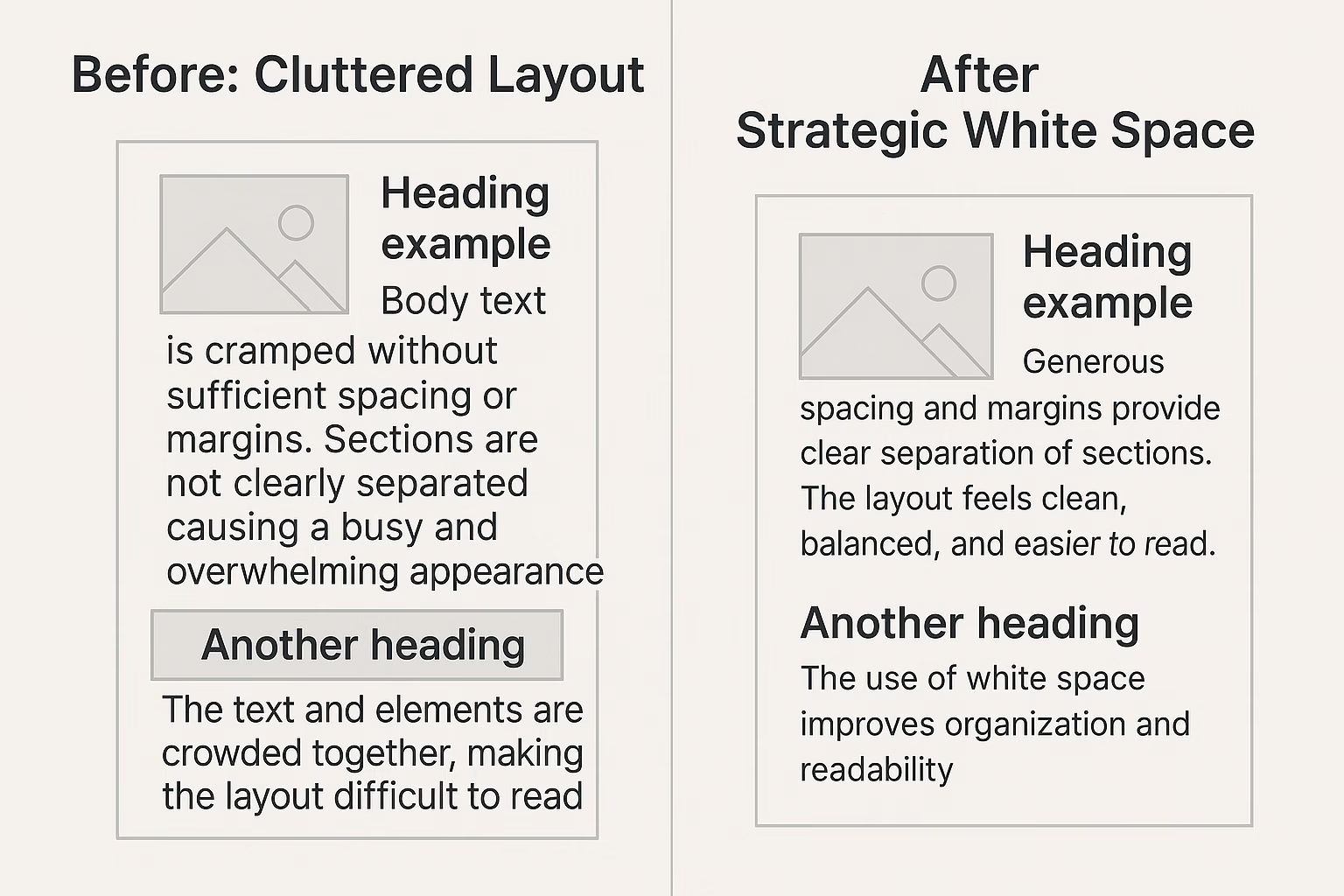
Test your white space balance by viewing your design from a distance. Can you still understand the basic structure? If elements blur together from 6 feet away, you need more white space to create clear differentiation.
Layer Design Elements Strategically
Layering creates depth and visual interest in print designs. Begin with a base layer that establishes your primary background. This might be a solid color, subtle texture, or gradient. Then add middle layers containing your main content elements like text and images.
For foreground layers, include attention-grabbing elements like highlighted information, calls to action, or special visual features. Keep the rule of 3-5 in mind: most effective designs have 3-5 distinct layers of information. More layers risk confusion; fewer may look flat.
When layering elements, maintain contrast between layers with techniques like:
- Color differentiation (60% contrast minimum between text and background)
- Size variation (scale elements differently between layers)
- Opacity adjustments (70-90% opacity creates subtle layering effects)
- Shadow effects (use sparingly with 2-4mm offsets for subtle depth)
Creating Visual Flow Through Layers
Arrange layers to create intentional visual flow. Western readers typically scan from top-left to bottom-right in a Z-pattern. Position your most important elements along this natural path. Use directional cues like arrows, lines, or the gaze direction of people in photos to guide the viewer’s eye through your hierarchy.
Test your layering by asking someone unfamiliar with your design to describe what they notice first, second, and third. If their perception matches your intended hierarchy, your layering is working effectively.
For print materials that will be handled physically (like brochures or catalogs), remember that lighting conditions will affect how layers are perceived. Test your design under various lighting conditions, especially if using metallic inks or specialty finishes.
Apply Finishing Techniques
Print finishing techniques transform ordinary designs into memorable experiences. Start with your design concept and budget to determine which finishing methods best enhance your message.
Spot UV coating adds shine to specific elements on a matte background, creating contrast between glossy and non-glossy areas. This works well for logos, important text, or images you want to highlight. Specify exactly which elements receive spot UV by creating a separate spot color layer in your design file.
Embossing and debossing add tactile dimension to your designs. These techniques work best on thicker paper stocks (100lb or greater). Keep embossed elements simple—intricate details may lose definition. Allow 0.125-0.25 inches (3-6mm) minimum space between embossed elements to maintain structural integrity.
Selecting the Right Finishing for Your Project
Match finishing techniques to your project goals:
- For luxury brands: foil stamping with embossing creates premium perception
- For environmental messaging: use subtle techniques like blind embossing that require no additional materials
- For functional materials: consider soft-touch coatings that improve grip and durability
- For high-impact marketing: combine techniques like spot UV over foil stamping
When designing for die-cutting, maintain at least 0.25 inches (6mm) between cut lines and important content. Create accurate die-line templates as separate layers in your design files, typically as vector paths in a distinct spot color.
Always request samples of finishing techniques from your printer before committing to a full production run. Physical samples will reveal how techniques look under different lighting and how they feel in hand—aspects impossible to judge from digital mockups.
Optimize for Print Production
Communication with your print provider is essential for success. Create a detailed print specification sheet that includes:
- Paper type, weight, and finish
- Color requirements (PMS, 4-color process, or both)
- Finishing techniques with specific locations
- Binding method and orientation
- Quantity and delivery timeline
- File format preferences
Set up your files with proper bleed (0.125 inches/3mm minimum), safety margins (0.25 inches/6mm from trim), and resolution (300dpi minimum for photos). Convert RGB images to CMYK and check color values—avoid rich black text (use 100% K instead) and keep total ink coverage below 300% to prevent drying issues.
Pre-press Checklist
Before sending files to your printer, complete this checklist:
- Check all linked images are properly embedded or included
- Convert text to outlines (keeping an editable backup)
- Remove unused colors from your swatches panel
- Create proper PDF/X-1a files for printing
- Run preflight checks to catch technical issues
- Provide clear instructions for folding, trimming, and assembly
- Request a physical proof for final approval
Allow adequate time for proofing and revisions. Digital proofs verify content accuracy, while hard proofs (physical samples) confirm color and finishing effects. Budget time for a press check for high-value or complex projects where you can approve the job on-site during printing.
Request printed samples before starting a large production run. These samples let you verify color accuracy, check finishing techniques, and test how the piece functions in real-world conditions. This step helps avoid costly reprints and ensures your final product meets expectations.
Advanced Tips for Sustainable Print Design
- Eco-conscious print design reduces environmental impact while maintaining quality
- Strategic design decisions can cut waste by up to 30% without sacrificing aesthetics
- Integration of sustainable practices enhances brand reputation among increasingly eco-aware audiences
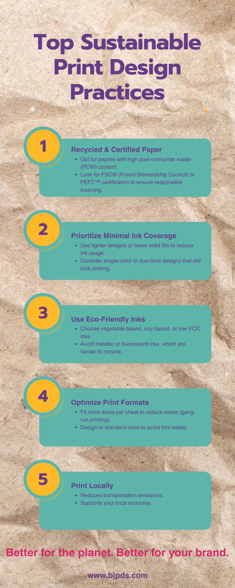
Use Eco-Friendly Materials
The foundation of sustainable print design begins with careful material selection. Paper choice represents the single largest environmental impact factor in print production. Traditional papers require significant water usage—up to 10 liters per A4 sheet—and contribute to deforestation. Switching to recycled paper reduces water consumption by 70% and energy use by 40%, according to studies from the Environmental Paper Network.
When selecting recycled papers, designers should look beyond simple recycled content percentages. The global sustainable printing market, valued at USD 2.07 billion in 2023 and projected to reach USD 3.35 billion by 2030, has driven development of higher-quality recycled stocks that perform comparably to virgin papers. Premium recycled papers now offer brightness levels of 96+, nearly identical to virgin stocks, eliminating previous concerns about image reproduction quality.
For designers seeking maximum environmental benefit, papers with FSC (Forest Stewardship Council) or SFI (Sustainable Forestry Initiative) certifications ensure responsible forestry practices. Alternative fiber papers made from agricultural byproducts like hemp, bamboo, or cotton waste offer additional sustainability benefits, including faster renewal cycles and reduced chemical processing. These papers provide unique textural qualities that can enhance design features while communicating sustainability values through their physical properties.
Ink Considerations Beyond Standard Options
Ink selection represents a critical yet often overlooked aspect of sustainable print design. Traditional petroleum-based inks contain volatile organic compounds (VOCs) that contribute to air pollution and pose health risks. Vegetable-based alternatives—particularly soy, linseed, and algae-derived inks—offer reduced environmental impact while providing excellent color saturation.
The biodegradable inks market has evolved significantly, with advanced formulations that decompose more quickly than traditional petroleum-based options while maintaining color vibrancy. For designers concerned with both aesthetics and sustainability, UV-curable inks offer a middle ground—they contain fewer VOCs than conventional inks and require less energy during the drying process, though they’re not fully biodegradable.
Special consideration should be given to metallics and fluorescents, which often contain heavy metals and are difficult to recycle. For projects requiring these effects, designers should explore alternatives like overprinting techniques or specialized coatings that achieve similar visual impact with reduced environmental harm.
Employ Sustainable Printing Practices
Printing processes themselves offer significant opportunities for sustainability improvements. Partnering with environmentally responsible printers provides access to technology and expertise that can dramatically reduce a project’s ecological footprint. When evaluating potential print partners, designers should investigate specific sustainability metrics rather than relying on general claims.
Questions to ask potential print vendors include: What percentage of their energy comes from renewable sources? Do they use closed-loop water systems? What waste reduction programs have they implemented? Leading sustainable printers like Walsworth have implemented comprehensive sustainability programs, including solar power systems and closed-loop recycling processes that dramatically reduce resource consumption.
Print-on-demand technology has transformed the sustainability equation for many print projects. This approach eliminates warehousing needs and reduces waste from overproduction, which traditionally accounts for 10-30% of print runs. For variable content projects like personalized marketing materials, print-on-demand systems can reduce paper waste by up to 40% compared to traditional offset methods.
Streamlining Production Workflows
Digital workflow optimization presents another sustainability opportunity that benefits both environmental impact and business efficiency. Cloud-based proofing systems eliminate physical proofs and associated shipping, potentially reducing carbon emissions by hundreds of kilograms per project. Digital asset management systems further improve efficiency by ensuring the most current files are always used, preventing wasteful reprints due to version control issues.
Automated imposition software optimizes paper usage by arranging multiple images on a single sheet to minimize waste. Advanced systems can reduce paper consumption by 15-25% through intelligent layout algorithms. For designers, understanding these capabilities means creating files that work effectively with these systems, including proper bleed settings and standardized document dimensions.
Design for Disassembly and Recycling
Forward-thinking sustainable print design considers the entire lifecycle of printed materials, including eventual disposal or recycling. This approach, known as “design for disassembly,” ensures that different components can be easily separated for appropriate recycling streams.
In practice, this means avoiding mixed materials that cannot be recycled together. For example, plastic lamination renders otherwise recyclable paper waste unrecyclable. Alternative coatings like aqueous varnishes provide similar protection while maintaining recyclability. When designing multi-component pieces, consider how materials will be separated at end-of-life. Mechanical fasteners like staples are preferable to adhesives for joining different materials, as they allow for easier separation during recycling.
The selection of binding methods significantly impacts recyclability. Perfect binding typically uses adhesives that complicate recycling, while saddle stitching with recyclable staples allows for easier processing. For projects requiring more substantial binding, consider sewn bindings using natural thread or mechanical bindings that can be removed before recycling.
Optimize Design Efficiency
Strategic design decisions can dramatically reduce resource use without compromising aesthetic quality. The most sustainable design is one that achieves maximum impact with minimum materials, making efficiency a core sustainability principle.
Rightsizing printed materials to their purpose eliminates unnecessary waste. Many standard sizes persist more from tradition than functional necessity. Questioning conventional formats often reveals opportunities for reduction—could that 8.5″×11″ brochure be just as effective at 8″×9″ with thoughtful redesign? A 10% reduction in dimensions can yield nearly 20% paper savings due to the geometric relationship between area and linear dimensions.
Typography choices affect sustainability through ink usage and readability. Fonts designed specifically for ink efficiency, like Ryman Eco and Ecofont, can reduce ink consumption by up to 30% while maintaining readability. These fonts feature tiny gaps or perforations invisible at normal reading sizes but significantly reducing ink coverage. For conventional fonts, lighter weights require less ink, and serif fonts typically use less ink than sans-serif at equivalent sizes due to their thinner strokes.
Layout Strategies for Waste Reduction
Grid-based layouts optimize both readability and sustainability by creating visual order while maximizing information density. Tightening margins by even small amounts can yield significant material savings across large print runs. Careful attention to white space ensures it serves communication purposes rather than simply consuming resources.
Text density represents another optimization opportunity. Concise writing reduces page count while typically improving communication effectiveness. For content-heavy documents, adjusting leading, tracking, and margins can increase words per page by 15-20% while maintaining readability, directly translating to material savings.
Communicate Sustainability Values
Effective sustainable print design doesn’t just implement eco-friendly practices—it communicates them appropriately. This transparency builds brand credibility and educates consumers about environmental considerations.
Environmental certification logos should be prominently displayed when applicable. These include FSC certification for paper, carbon-neutral printing declarations, or other relevant third-party verifications. However, designers must verify all environmental claims meet legal standards to avoid “greenwashing” accusations that can damage brand reputation.
Consider including concise sustainability statements that quantify environmental benefits. For example: “Printed on 100% post-consumer recycled paper, saving 17 trees and 7,000 gallons of water compared to virgin paper.” Such concrete metrics help readers understand the significance of sustainable choices more effectively than general environmental claims.
The design aesthetic itself can reinforce sustainability values. Natural color palettes, organic textures, and visible recycled paper fibers can subtly communicate environmental commitment. However, balance is essential—overtly “green” aesthetics may appear clichéd or inauthentic if not aligned with overall brand identity.
Measure and Improve Environmental Impact
Implementing sustainability metrics creates accountability and identifies opportunities for continuous improvement. Several standardized tools exist to measure the environmental impact of print projects.
Environmental calculators like the Environmental Paper Network’s Paper Calculator provide detailed impacts of paper choices, including greenhouse gas emissions, water usage, and solid waste generation. These tools allow designers to compare different options and quantify improvements from sustainable choices.
Life cycle assessment (LCA) provides the most comprehensive environmental evaluation, examining impacts from raw material extraction through manufacturing, distribution, use, and disposal. While full LCAs require specialized expertise, simplified tools like the EcoDesign Checklist for Graphic Designers offer accessible frameworks for considering environmental impacts throughout the design process.
Setting improvement targets creates accountability and demonstrates commitment to ongoing progress. These might include reducing paper weight by 10% across all materials, increasing recycled content by 15% annually, or cutting transportation emissions by 20% through local production. Regular reporting on these metrics builds credibility with stakeholders and identifies areas for further improvement.
Sustainable print design represents not just responsible environmental practice but increasingly a business necessity as consumers and regulations demand greater accountability. By integrating these advanced sustainability practices, designers can create print materials that minimize environmental impact while maximizing communication effectiveness and brand value.
1. Innovative Print Technology for Better Results
- Digital printing advances now offer precision and efficiency previously unavailable
- AR integration creates interactive print experiences that increase engagement
- Specialized inks and finishes can dramatically enhance physical products
Adopt Digital Printing Advances
Digital printing technology has changed dramatically since 2023. The latest systems now produce higher-resolution images with more precise color matching than ever before. Modern digital presses achieve resolutions up to 2400 DPI (dots per inch), creating prints that match or exceed traditional offset quality. This matters because these advances allow designers to create more detailed, vibrant materials without sacrificing production speed.
The digital printing market is growing rapidly, estimated at $38.08 billion in 2025 and projected to reach $121.3 billion by 2032, with an 18% compound annual growth rate. This growth reflects how valuable these technologies have become to print professionals. The precision available now helps businesses create materials that stand out in increasingly competitive markets.
Variable Data Printing (VDP) represents one of the most practical advances. This technology allows each printed piece to contain unique elements while maintaining consistent branding. Research shows personalized materials generate significantly higher response rates—often 30-50% higher than generic alternatives. For example, a retail catalog can dynamically change product offerings based on a customer’s previous purchases, dramatically improving conversion rates.
Equipment Selection Criteria
When adopting digital printing technology, consider these factors:
- Resolution capabilities (minimum 1200 DPI for professional results)
- Color gamut range (look for systems that achieve at least 95% of Pantone colors)
- Print speed balanced against quality requirements
- Media flexibility (ability to print on various thicknesses and textures)
- Total cost of ownership including supplies and maintenance
Explore Augmented Reality (AR) in Print
AR technology bridges the gap between physical print materials and digital content. When implemented correctly, print materials become portals to interactive experiences that were impossible just a few years ago. The process typically involves embedding invisible markers or QR codes that, when scanned with a smartphone, trigger digital content overlays.
The most effective AR print implementations aren’t just novelties—they provide genuine value to the reader. For example, furniture catalogs now commonly include AR features that allow customers to visualize products in their own spaces before purchasing. Technical manuals use AR to show animated assembly instructions rather than static diagrams. These practical applications increase comprehension and engagement.
Implementation requires collaboration between print designers and digital developers. The technical requirements include:
- Clean marker designs that remain scannable even with minor print variations
- Fast-loading digital assets optimized for mobile devices
- Clear instructions for users to access the AR content
- Content that provides genuine value beyond what static print can deliver
Invest in Specialized Inks and Finishes
Beyond standard CMYK, specialized inks create stunning effects that can’t be replicated digitally. Thermochromic inks change color with temperature variations, making interactive packaging possible. Photochromic inks respond to UV light, revealing hidden messages when exposed to sunlight. These functional inks turn passive print materials into interactive experiences.
Metallic and fluorescent inks continue to advance, with new formulations providing more vibrant results while requiring fewer press passes. The latest metallic inks achieve reflective qualities previously possible only through foil stamping, but at substantially lower cost and production time.
Specialty coatings add tactile dimensions to print materials. Soft-touch coatings create a velvet-like surface that increases perceived value. According to consumer research by the Paper and Packaging Board, materials with tactile elements hold reader attention 37% longer than standard printed pieces. This extended engagement translates directly to improved message retention.
Environmental Considerations
When selecting specialty inks and finishes, balance visual impact with sustainability:
- Look for low-VOC (Volatile Organic Compound) formulations
- Consider water-based alternatives to UV-cured options when possible
- Ask suppliers about biodegradability and recycling compatibility
- Test samples for durability to ensure longevity (reducing replacement needs)
Dr. Sarah Johnson’s research at the Environmental Print Institute found that eco-friendly specialty inks have improved dramatically, now matching conventional alternatives in vibrancy while reducing environmental impact by up to 40%.
Implement Automated Quality Control
AI-driven print quality control systems now detect defects with greater accuracy than human inspection. These systems use high-speed cameras and machine learning algorithms to identify problems like color shifts, registration errors, and surface flaws in real-time. By 2025, approximately 15% more printers will incorporate AI-driven quality control, significantly reducing waste and improving consistency.
These automated systems excel at detecting subtle issues that might escape human notice, particularly in high-volume production environments. For instance, they can identify a 2% color shift across a print run—a deviation barely perceptible to the human eye but potentially significant for brand consistency.
The data gathered through automated quality control provides valuable insights for process improvement. Tracking patterns of defects over time helps identify equipment maintenance needs before they cause production problems. This predictive approach reduces downtime and extends equipment life.
For print buyers, the key questions to ask potential vendors include:
- What quality control technology do they use?
- How do they document quality metrics across print runs?
- What is their procedure when defects are detected?
- How do they ensure color consistency across different equipment?
Embrace On-Demand Production Models
Print-on-demand technology has evolved from a compromise solution to a strategic advantage. Modern digital presses produce small quantities economically while maintaining professional quality. This shift eliminates the cost barriers that previously forced businesses to order large quantities to achieve reasonable unit costs.
On-demand production offers several strategic benefits:
- Reduced inventory costs and storage requirements
- Ability to test multiple versions before committing to large runs
- Easier updates and corrections as information changes
- Lower environmental impact through reduced waste
The economics of print-on-demand now make sense for runs up to 1,000 pieces for many applications, a significant increase from the 250-piece threshold common just a few years ago. This expanded range opens new possibilities for businesses that previously couldn’t justify professional print production for smaller projects.
Data-driven analytics help optimize the decision between on-demand and traditional production. Software tools now analyze historical usage patterns, seasonal demand fluctuations, and distribution costs to recommend the most efficient production approach for each project. These tools account for not just production costs, but total lifecycle expenses including storage, obsolescence, and transportation.
Troubleshooting Common Issues
- Learn to fix color problems through proper calibration and color model selection
- Master alignment troubleshooting with precise document setup and pre-press checks
- Prevent printing problems before they happen with systematic quality control steps
Address Color Inconsistencies
Print projects often suffer from color discrepancies between what appears on screen and what comes out of the printer. These inconsistencies can frustrate clients and require costly reprints. The root cause typically lies in improper calibration or incorrect color settings.
To systematically address color issues, start with monitor calibration. Use a hardware calibration device rather than relying on visual adjustments. These devices measure how your monitor displays color and creates a profile that compensates for any deficiencies. Schedule calibration monthly as monitors drift over time. For critical color work, calibrate weekly.
Next, ensure printer calibration matches your monitor settings. G7 calibration has become the industry standard for maintaining color consistency across different printing devices. According to research, implementing G7 calibration significantly reduces color discrepancies between print runs and helps maintain client confidence in your work.
Setting Up Proper Color Profiles
Color profiles act as translators between devices, ensuring colors appear consistent across platforms. For each printer, paper, and ink combination, create and save a specific ICC profile. These profiles define how colors should display and print on each specific setup.
- Download manufacturer ICC profiles for your specific printer model
- Install profiles in your system’s color management folder
- In design software, assign the appropriate profile to each document
- Use soft proofing features to preview how colors will print
- Create a test sheet with color swatches to verify profile accuracy
Always work in CMYK color mode for print projects. RGB colors look vibrant on screen but often print dull or inaccurate. Convert all RGB images to CMYK before finalizing designs. Be aware that some bright RGB colors have no exact CMYK equivalent – these “out of gamut” colors require careful adjustment to maintain design intent.
Color Consistency Across Multiple Prints
For projects requiring multiple print runs or various printed components, consistency becomes even more critical. Create a color standard by printing and approving a reference sample. Keep this sample protected from light exposure to prevent fading, and use it to match all subsequent print runs.
Consider these additional steps to maintain color consistency:
- Document all printer settings for each successful print job
- Control environmental factors like temperature and humidity in print areas
- Use the same paper stock and ink supplier throughout a project
- Implement regular printer maintenance schedules to prevent color drift
- Keep detailed records of any color adjustments made between print runs
Color calibration is not just about technical accuracy but also about meeting client expectations. As highlighted in industry research, failing to meet color standards in fields like architecture and engineering can result in legal issues and costly rework, emphasizing the importance of precise calibration. Surprising Ways Color Calibration Transforms Print Quality
Fix Alignment Problems
Alignment issues can transform a professional design into something that looks amateur. These problems typically manifest as text or images that appear off-center, uneven margins, or elements that cut off unexpectedly at the edges.
Start by checking your document setup. Confirm that your page size matches the intended final product dimensions. Add bleed areas of at least 3mm (1/8 inch) beyond the trim edge for any elements that should extend to the page edge. This prevents white borders from appearing if the cutting process isn’t perfectly aligned.
Document margins serve as safety zones for important content. Set interior margins at least 6mm (1/4 inch) from the trim edge to ensure text and critical elements don’t risk being cut off. For bound publications, increase the inside margin to accommodate binding space – typically 10-12mm (3/8-1/2 inch) depending on binding method.
Detecting and Fixing Common Alignment Errors
Alignment problems often stem from multiple sources. Here’s a systematic approach to identify and resolve them:
- Check ruler origin points in your design software to ensure they match your document settings
- Verify that guides and grids are correctly positioned and that “snap to” functions are enabled
- Examine master pages for inconsistencies if using template-based layouts
- Look for accidentally moved text frames or image boxes
- Ensure all pages have consistent margins throughout the document
Pre-press proofs are essential for catching alignment issues before final printing. Request both digital proofs (PDF) and physical proofs when possible. Digital proofs help identify basic layout issues, while physical proofs reveal potential production problems that might not be visible in digital format.
When examining proofs, use these specific techniques:
- Hold the proof at arm’s length to spot overall alignment issues
- Check that parallel elements truly appear parallel
- Verify that margins are consistent from page to page
- Ensure folded items align correctly when folded
- Confirm that multi-page documents maintain consistent positioning throughout
According to printing industry experts, regular pre-press proofs and test prints are standard practices to catch alignment and color issues before full production. This step helps avoid costly errors and ensures client approval before mass printing.
Technical Solutions for Precise Alignment
For perfect alignment, use registration marks in your design files. These marks appear outside the trim area and help printers align different color plates or printing passes. Most design software can automatically add these marks when exporting print-ready files.
To check for alignment issues in existing documents:
- Turn on all layout guides and grids in your design software
- Use the software’s alignment tools to select and align multiple elements
- Create custom guides for recurring elements across multiple pages
- Use the “Transform Again” function (or equivalent) to ensure consistent spacing
- Implement baseline grids for text alignment across columns and pages
For complex projects, consider creating a comprehensive imposition proof. This shows how all pages will be arranged and printed on the press sheet before cutting and binding. Review this carefully to catch potential alignment issues in the printing and finishing process.
Manage Resolution and Image Quality
Print materials with pixelated or blurry images immediately signal poor quality to viewers. These problems typically stem from insufficient image resolution or improper file handling during the design process.
Start by ensuring all images meet the minimum resolution requirements for print: 300 dpi (dots per inch) at 100% of their final printed size. This standard provides sufficient detail for most printing methods. For large format printing viewed from a distance, you can sometimes use lower resolutions (150-200 dpi), while fine art or detailed prints may require higher resolutions (450-600 dpi).
To verify image quality before printing:
- Check image resolution in your design software (look for document or image info panels)
- View images at 100% zoom to assess actual print quality
- Examine areas with fine details or text overlaid on images
- Look for artifacts, compression issues, or moiré patterns
- Verify that image color profiles match your document color settings
Correcting Common Image Problems
When working with problematic images, follow these steps to improve quality:
For low-resolution images:
- Return to the original source for a higher-resolution version
- If unavailable, consider redesigning with a different image
- As a last resort, use image enhancement software to improve appearance
- Adjust the image’s printed size downward to increase effective resolution
For images with color or contrast problems:
- Adjust levels or curves to improve contrast
- Use selective color adjustments to correct color casts
- Apply minimal sharpening to enhance details (but avoid over-sharpening)
- Convert RGB images to CMYK using proper color profiles
- Check shadow and highlight details to ensure they’ll reproduce well in print
Regular printer maintenance is necessary to prevent resolution problems related to hardware. This includes cleaning print heads, calibrating paper feed mechanisms, and replacing worn components. Established maintenance schedules prevent gradual quality degradation that might otherwise go unnoticed until it becomes severe.
Troubleshoot File Preparation Issues
Many print problems originate before the project reaches the printer. Proper file preparation is critical for successful printing outcomes. Common file issues include missing fonts, linked images, and improper export settings.
Create a standardized pre-flight checklist for every project:
- Check for missing or problematic fonts
- Verify all linked images are included and up-to-date
- Confirm all colors are in the correct color mode (typically CMYK)
- Ensure document dimensions and bleeds are correct
- Verify that all transparencies are properly flattened for print
- Check for overprinting objects that might create unexpected results
- Confirm appropriate resolution for all raster elements
- Verify that all text is legible at final printed size
Most professional design software includes pre-flight tools that automatically check for these issues. Use them before finalizing any print project to catch problems early.
Creating Print-Ready PDF Files
The PDF format has become the standard for print file submission. However, not all PDFs are suitable for professional printing. Follow these steps to create proper print-ready PDFs:
- Use PDF/X standards appropriate for your printing method (commonly PDF/X-1a or PDF/X-4)
- Include bleed areas and crop marks
- Embed all fonts or convert text to outlines
- Set appropriate compression options that maintain image quality
- Include metadata like project name and contact information
- Verify color management settings match your printer’s requirements
After creating the PDF, open it in Adobe Acrobat or another PDF reader to check for any issues. View all pages, verify that fonts appear as expected, and check that images remain clear. Use the “Output Preview” tool in Acrobat Pro to simulate overprinting and check color separations.
For complex projects, send test files to your printer before completing the entire job. This allows them to identify any file issues specific to their printing system and provide feedback before you commit to final production.
By systematically addressing these common trouble areas, you’ll significantly reduce printing problems and achieve more consistent, high-quality results. Remember that prevention through proper setup is always less expensive and time-consuming than fixing problems after printing has begun. Understanding RGB, CMYK, and Spot Colors: Choosing the Right Color Space for Your Project
Further Resources and Reading
- Expand your print design knowledge beyond basics with trusted resources
- Connect with a community of print designers for ongoing learning and inspiration
Print design is both an art and a science. This section points you to valuable resources that will help you stay at the top of your field in 2025.
[Dive Deeper]:
- Print Is Dead? Think Again – Research report showing the growth areas in print
- Adobe Print Resource Center – Technical guides and templates
- “The Tactile Design Podcast” – Weekly discussions with print design experts
Online forums and communities provide access to insights from other designers facing similar challenges. The Print Design Alliance forum hosts weekly discussions on current trends and technical solutions. These community spaces are ideal for getting feedback on your work and learning from others’ experiences.
The Print + Beyond Conference, held quarterly in major cities, connects designers with printers and material suppliers. Attending these events can help you build relationships with production partners who understand your design goals.
[Action Items]:
- Join at least one print design community this week and introduce yourself
- Subscribe to a print design newsletter for weekly industry updates
- Create a digital folder to save inspiring print designs you encounter
Why Print Design Remains Important
In a digital world, print materials create physical connections with audiences that digital media cannot match. Research shows that people spend 21% more time looking at printed materials than digital ones, and retention of information is 30% higher when read in print format.
The tactile experience of print creates stronger emotional connections. The texture of paper, weight of a business card, or finish on a brochure all communicate subtle messages about brand quality and values. The Johns Hopkins Print Perception Study (2024) found that tactile experiences activate more areas of the brain than digital ones, leading to stronger memory formation and emotional responses.
Print design serves as a tangible brand ambassador. When digital marketing faces increasing competition for attention, a well-designed print piece can stand out. The 2025 Marketing Channel Effectiveness Report shows that integrated campaigns using both print and digital elements see 28% higher engagement rates than digital-only campaigns.
For luxury brands and important messages, print communicates permanence and value. The research firm PrintStats reports that 72% of consumers associate high-quality print materials with trustworthy brands. This perception is particularly strong among high-income demographics and business decision-makers.
[Dive Deeper]:
- The Neuroscience of Touch – Research on how tactile experiences affect perception
- “Print in the Mix” Research Database – Collection of studies on print effectiveness
- Print Marketing ROI Calculator – Tool for measuring print campaign effectiveness
Print also serves as an effective digital marketing complement. QR codes, augmented reality markers, and personalized URLs on print materials create bridges between physical and digital experiences. The 2025 Direct Marketing Association report shows that these connected print campaigns generate 34% more leads than standalone digital campaigns.
[Action Items]:
- Audit your current portfolio to ensure you have strong print design examples
- Create a one-page document outlining the benefits of print to share with digital-focused clients
- Identify three ways to integrate digital elements into your next print project
Conclusion
Print design in 2025 blends time-tested principles with fresh innovations. The path forward combines thoughtful material selection, strategic layouts, and sustainable practices with cutting-edge AR integration and digital print advancements. As you apply these best practices, remember that effective print design balances form and function—creating materials that not only look good but also communicate clearly.
Your print projects will stand out when you embrace white space, master typography, and align your design decisions with your audience’s needs. The print medium continues to offer unique advantages in our digital world: tactile experiences that engage multiple senses and create lasting impressions.
Take one technique from this guide and implement it in your next project. Perhaps try variable data printing for personalization or integrate AR elements to bridge the physical-digital divide. Start small, measure results, and build on your successes.
The most effective print designs of 2025 will come from designers who respect print traditions while boldly embracing new possibilities. Your work matters—it creates physical touchpoints in an increasingly virtual world.
What will you design next?