
Tips for an Effective Web Site
March 25, 2022
As a graphic designer, I am constantly looking and evaluating anything design-related that I come in contact with. From menus at the restaurant, other business’ business cards, web designs to even billboards as I drive, I can’t help but look at something and appreciate what is working and critique what is not.
One that really gets me the most is websites.
They are so easy to make and get set up, that so many people who are not trained designers are doing them to save money. This is great—and I completely understand needing to save some cash—but at the same time, people need to take the time to research to make sure that their website is going to work for them, and be effective at its goal.
In the spirit of education, I have scoured and found some tips to help people create an effective site (of course, BJPDS can help you with your web design too!)
Keep your web design clean and clutter-free!
This is a big one for me, and it’s one that took me a while to understand and accept.
Just like when talking to a prospect, people have a tendency to do what I like to call, “Spew and Pray”. A salesperson Spews all the information they know about the product or service at the prospect their talking to, and then pray the prospect buys the product.
The same thing can happen on a web page.
A person can have so much information they want to convey on the website, that they put it all out there and it’s just too overwhelming to a potential prospect. They don’t know where to start and it’s just too much to take in.
Alternatively, a person can have lots of graphics, buttons, or widgets they want to use, it can also make the website seem cluttered and crowded and can break up the flow of your content or distract the potential client…which comes to my next point…
Direct your viewer’s eyes on the site and make them DO something.
Traditionally with print materials, like books or brochures, our society has been bred to read from top to bottom, left to right. The same holds true to websites, except that since a website can be fluid and have links to other pages, eyes will drift and wander. Having other widgets or items on a page can make them move from the important information to non-important information.
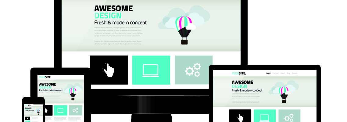
Each page on your site should have a starting point. This point should be very noticeable and eye-catching to get their attention. The content should flow underneath that. Take a look at this site. Notice the large words FRESH. It directs your eyes to it first.
The content should then link to all the important areas you want them to view. Look at this site (click on any location). Notice how the graphic grabs your attention, then the navigation is underneath it. They direct your eyes where they want you to go.
And finally, each page should have an action item. Something you want the prospect to DO. Should they contact you? Do you want them to fill out a form? How about clicking a link or taking a survey or clicking the next page? Make sure that you have them doing something to get the results you want, whether it is reading more, or gathering their information.
Your Web Design Navigation is clear and easy.
It’s important to have a navigation bar that is prominent and easy, with not too many links, but enough to hold all your content pages. If you look above at my site navigation, you can see that it only has a few main options, that drop down to specific areas. It’s clean and not cluttered.
Making sure that your navigation is sectioned by Main categories and then subcategories, helps viewers find information quicker.
Alternatively, making sure your site’s content and design is in an organized fashion that follows your navigation is important too. Using the grid system in your design helps to keep things organized and uncluttered.
“Above the fold”.
Above the fold is a print term that has been adapted for the web industry. This term refers to the portions of a webpage that can be visible without scrolling. Keeping important information or action items, “above the fold” helps the prospect get to the nitty-gritty first, and then have the option to read the supplemental information if they want.
Follow your brand.
If you’ve invested a lot of time in your brand, make sure that it stays consistent across not only your website but your entire media collateral. It’s what makes you instantly recognizable with your clients before they even read the content. Look at popular brand names like Nike, or stores like Best Buy. You can tell a brochure or product or service is from them, before you even really see their name, simply from the colors they use and/or their logo.
If you don’t have a brand, invest in one! It can be an important aspect of your marketing plan and a way to help keep your website from growing out of control. (BJPDS Designs can help you come up with a comprehensive brand identity package).
Proof your content.
Make sure that you proof your content. Spelling errors can seem unprofessional and make a prospect question your authority over a particular product or service.
Proofing your content can also help you to “trim the fat”. Take a step back and read it as if you’re a prospect and have never seen the content before. What works? What strikes a chord? Anything that seems excessive or too much information, or perhaps complicated to understand?
Giving your content a once- or even a twice-over can really help you make your content shine!
These are just a few suggestions that can help you get your website off the ground and working FOR you and not you working FOR it. For more tips & tricks, contact us above!