Understanding RGB, CMYK, and Spot Colors: Choosing the Right Color Space for Your Project
July 14, 2024

When it comes to graphic design and printing, choosing the right color space is crucial for achieving the best results. At BJPDS, we understand the importance of color accuracy and consistency in every project. In this blog post, we’ll explore the differences between RGB, CMYK, and Spot colors to help you make informed decisions for your design needs.
RGB Color Space: The Digital Spectrum
What is RGB?
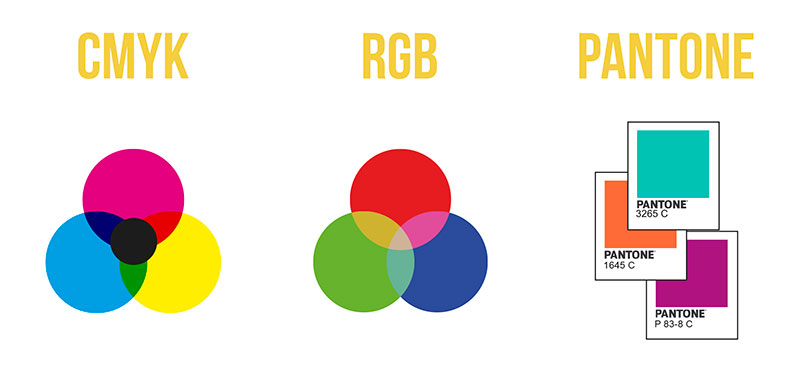
RGB stands for Red, Green, and Blue. It is an additive color model used primarily for digital displays such as monitors, televisions, and mobile devices. In this model, colors are created by combining different intensities of red, green, and blue light. When these colors are combined at full intensity, they produce white light.
When to Use RGB?
RGB is ideal for any project that will be viewed on a screen. This includes:
- Website graphics
- Digital advertisements
- Social media posts
- Video content
Since RGB is based on light, it can produce a wide range of vibrant colors, making it perfect for creating eye-catching digital designs.
CMYK Color Space: The Print Palette
What is CMYK?
CMYK stands for Cyan, Magenta, Yellow, and Key (Black). It is a subtractive color model used in color printing. Unlike RGB, which combines light to create colors, CMYK subtracts varying percentages of light absorbed by the paper. By overlapping different amounts of these four inks, a wide range of colors can be produced.
When to Use CMYK?
CMYK is the go-to color model for any printed materials. This includes:
- Brochures
- Business cards
- Posters
- Packaging
Printing with CMYK ensures that the colors you see on your screen will closely match the colors on the final printed product. It’s essential to convert your digital designs from RGB to CMYK before sending them to the printer to avoid any unexpected color shifts.
Spot Colors: Precision and Consistency
What are Spot Colors?
Spot colors, also known as Pantone colors, are pre-mixed inks used in printing to achieve specific hues that cannot be accurately reproduced with CMYK. Each spot color is created from a single run of ink, ensuring consistency and precision.
When to Use Spot Colors?
Spot colors are ideal for projects that require:
- Exact color matching (e.g., brand logos)
- Special effects (e.g., metallic or fluorescent inks)
- Limited color palettes
By using spot colors, you can maintain brand consistency across various printed materials and achieve colors that are not possible with standard CMYK printing.
Making the Right Choice
At BJPDS, we believe that understanding the differences between RGB, CMYK, and Spot colors is essential for delivering high-quality designs that meet your needs. Here’s a quick recap to help you choose the right color space for your project:
- RGB: Best for digital projects and vibrant on-screen displays.
- CMYK: Ideal for most printed materials to ensure accurate color reproduction.
- Spot Colors: Perfect for precise color matching and special printing effects.
By selecting the appropriate color space, you can ensure that your designs are visually stunning and perfectly suited for their intended medium. If you have any questions or need assistance with your next project, our team at BJPDS is here to help. Contact us today to bring your vision to life with the right colors and expert design services.
Stay tuned for more tips and insights from BJPDS. Your journey to exceptional design starts here!

