
Another Roofer. Another Roof Logo. Groundbreaking.
October 13, 2026
Your logo doesn’t have to show what you do. It needs to make people remember who you are.
I work in the printing industry, and let me tell you, I’ve seen a LOT of roofing and construction company logos.
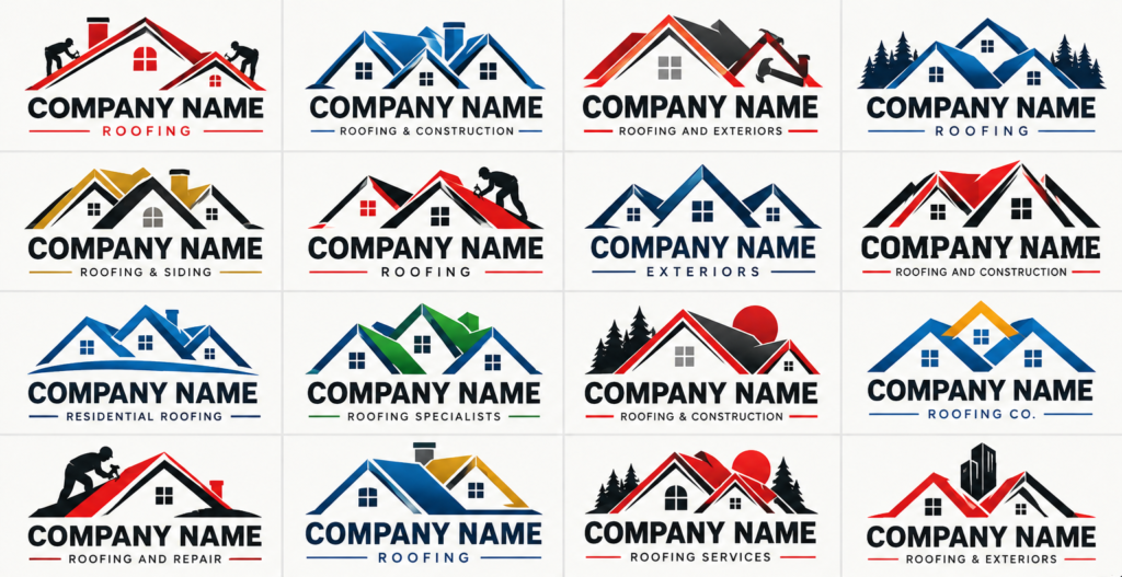
Three roof peaks. Maybe a window or two. A chimney if we’re feeling adventurous. Throw in some bold lettering, usually in red, blue, or black, and you’ve got yourself another roofing company logo.
And that’s just what comes through the print shop. I see even more of them on trucks and trailers during my daily commute.
Here’s the thing: They’re all starting to look alike.
Over the past 18 months, I’ve noticed this trend becoming increasingly common. More and more roofing and construction companies seem to be using remarkably similar designs.
And just to be clear, I’m not calling out any one company in particular. I’m sure many of these businesses do fantastic work, and I’m certainly not questioning their craftsmanship. This is simply an observation I’ve made as someone who works with logos and printed materials every day.
But it does raise an important question: If your logo looks like everyone else’s, how are potential customers supposed to remember you?
Your logo isn’t a job description.
Now, there’s nothing inherently wrong with using a roof or a house in your logo. It makes sense. You’re a roofer. You work on roofs. I get it.
But when dozens of companies are using nearly identical imagery and color combinations, it’s hard for any one business to stand out.
Here’s something I wish more business owners understood:
Your logo doesn’t have to literally illustrate what your business does.
It could be inspired by your company’s name. It could be an interesting abstract shape, a clever combination of letters, or a distinctive symbol that has absolutely nothing to do with a house.
Think about some of the most recognizable brands in the world. Their logos aren’t necessarily pictures of the products or services they sell. They’re symbols we’ve learned to associate with those companies.
That’s what good branding does.
Your logo should be distinctive, memorable, and recognizable. Something that catches someone’s eye on the side of your truck, looks fantastic on a yard sign, and sticks in their mind when they actually need your services.
And roofers, I’m not picking on you. I promise.
Roofing and construction companies just happen to be the examples I’m using because I see so many of their logos in my line of work.
The same thing happens in practically every industry. Real estate agents with rooftops and keys. Landscapers with trees and leaves. Cleaning companies with bubbles and sparkles. Photographers with cameras and apertures.
There’s nothing inherently wrong with any of those symbols. They’ve just been used so frequently that it’s easy for one company’s identity to get lost among everyone else’s.
Here’s a little advice for anyone thinking about creating or updating their logo:
Google your logo idea. Seriously.
Search for logos in your industry. Look up the symbols you’re considering. See what your competitors are doing.
How many look alike? Are they using the same colors, fonts, shapes, and imagery? Does your idea look suspiciously familiar?
If you put your proposed logo in a lineup with 20 competitors, would yours stand out? Or would it disappear into the crowd?
This doesn’t mean you need to abandon every familiar symbol. Sometimes a clever interpretation of a common idea can work beautifully.
But a little research before you commit to a design can help you avoid looking like everybody else.
And while you’re researching, remember that a Google search is a starting point, not a substitute for a proper trademark search before adopting a new brand identity.
And while we’re at it, let’s talk about all that detail.
There’s another trend I’ve noticed recently: Some of these logos are getting WAY too complicated.
Detailed rooflines, tiny windows, individual shingles, chimneys, gradients, shadows, and sometimes what looks like an entire architectural rendering squeezed into one logo.
They might look impressive when they’re displayed nice and big on a computer screen.
But what happens when you shrink them down?
One of the simplest ways to evaluate a logo is doing a scalability test.
Take your logo and shrink it down to the size it might appear on a business card, an embroidered polo shirt, or a small promotional item.
Can you still recognize it? Are the details still distinguishable? Is the lettering readable? Does the design still work in a single color?
If those tiny windows disappear, the rooflines merge together, or the whole thing becomes an unrecognizable blob, you’ve got a problem.
And trust me, working in the printing industry, I see firsthand how these design choices affect the finished product.
A great logo needs to work at more than one size.
Sometimes that means simplifying the original design. Other times, it means creating a secondary version specifically for smaller applications.
Either way, adding more detail doesn’t automatically make a logo better. Sometimes it just makes it harder to use.
Your reputation deserves a memorable identity.
Think about how people encounter your brand.
They see your truck at a stoplight. They drive past your yard sign. They spot your logo on a contractor’s shirt at the hardware store.
You might have only a few seconds to make an impression.
Now imagine your logo looks nearly identical to five other roofing companies they’ve seen that week.
Even if they remember seeing a roofing company, will they remember which one?
You work hard to build a reputation for quality, reliability, and craftsmanship. Your visual identity should reflect that same level of care.
And here’s the part I really want business owners to understand: You don’t have to follow the same visual formula as everyone else in your industry.
Be different. Be recognizable. Give people something they’ll associate with YOUR company.
Let’s build something worth remembering.
If you’re a roofing or construction company, take another look at your logo.
Does it stand out from your competitors? Does it work at different sizes? Would someone recognize it without your company name attached?
Most importantly, will someone remember it?
At Bert Jones Productions & Design Studio, I help businesses create distinctive, memorable brand identities that reflect who they are and work across everything from business cards to vehicle graphics.
If your current logo is getting lost among all those roof peaks, maybe it’s time for something different.
Let’s create a brand people won’t forget.
Inclusive by default. Fabulous by design.